Further testing of the time-stamping hardware. The idea was to generate a weak beam of light with an intensity modulation at 1-12 MHz, count and time-stamp the photons, and see if the modulation can be measured with a correlation histogram.
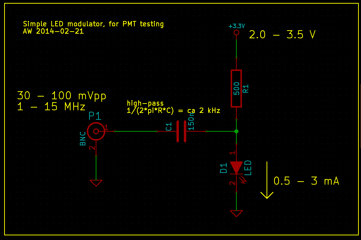
To generate a stream of photons intensity modulated at a frequency f_mod I used this simple LED circuit driven by an adjustable DC power-supply and a signal generator. I didn't test the bandwidth of the circuit and LED, but it seems to work well for this test at least up to 12 MHz.
If we are given such a stream of photons, with an average rate of say 10 kphotons/s, how do we detect that the modulation at MHz frequencies is there? Note that the average rate of photons is much much smaller than the modulation frequency. If we receive photons at 10 kcounts/s there is on average 1000 cycles of modulation between each photon-event, when f_mod=10 MHz.
One way is to count the photons with a photon-counter, and time-stamp each photon. We should now on average see more/less photons every 1/f_mod seconds. So if we histogram all time stamps modulo 1/f_mod, we should get a sine-shaped histogram. This assumes that the signal generator creating f_mod and our time-stamping hardware share a common time-base.
This works quite nicely!
At the start of the video we see only the dark counts of the PMT. A DC voltage is then applied to the LED and the histogram rises up, but remains flat. When the modulation is applied we immediately see a sine-shape of the histogram. If we adjust the the frequency, phase, or amplitude of the modulation we see a corresponding change in the histogram.
The video first has testing at f_mod=1 MHz, with a histogram modulo 1/f_mod = 1000 ns, and later with f_mod=12 MHz and the histogram modulo 83333 ps. The later part of the video also has a least-squares sin() fit to the data.
This technique is very sensitive to mismatch between the applied frequency f_mod, and the histogram mod-time 1/f_mod. I first wanted to try this at 12 MHz, so I set the histogram mod-time to 83333 ps - and saw no sine-histogram at all! This was because I had rounded 1/f_mod to the nearest picosecond, and 1/83333 ps is actually 12 000 048 Hz - not 12 MHz!
At 12 MHz a deviation of 48 Hz is a few ppm in fractional frequency, and I later tested that changing f_mod by a fraction of ca 1e-8 makes the histogram slowly wander to the left or right. Any larger deviation and the correlation is lost.
All of this is similar to a lock-in technique, so the same principles should apply.